
Opendoor and Offerpad both operate in the online home-buying space. They are in the same business, face the same housing market, and react to many of the same economic forces. But their stocks have told very different stories.
In this post, we compare Opendoor (OPEN) and Offerpad (OPAD) by looking at their stock performance, how much their prices moved up and down, and the key news events that affected them.
Housing stocks can be very sensitive to interest rates, earnings results, and changes in the housing market. That means prices can swing sharply, sometimes on headlines alone. We’ll look at which company handled those swings better and which news events caused the biggest reactions.
By the end, you’ll have a clear view of how these two stocks compare—not just in returns, but in volatility and how they respond when big news hits.
2025 Summary: Opendoor (OPEN) vs Offerpad (OPAD)
| Metric | OPEN | OPAD |
|---|---|---|
| Start Date | 2025-01-02 | 2025-01-02 |
| End Date | 2025-12-30 | 2025-12-30 |
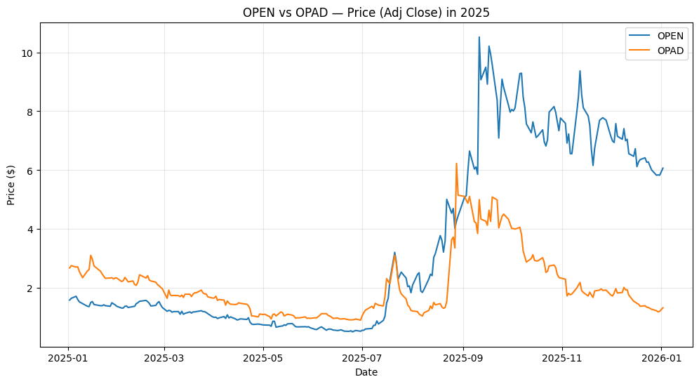
| Start Price | $1.59 | $2.68 |
| End Price | $5.84 | $1.19 |
| YTD Return | +267.30% | -55.60% |
| Annual Volatility | 165.78% | 207.05% |
| Max Drawdown | -70.23% | -80.90% |
| Best Day | +79.52% | +136.36% |
| Worst Day | -24.60% | -24.78% |
What This Table Shows
- OPEN strongly outperformed OPAD in 2025. OPEN more than tripled in price, while OPAD lost over half its value.
- OPAD was more volatile. Its price moved more sharply up and down, with higher volatility and a deeper drawdown.
- Both stocks were very risky. Large daily moves and deep drops show that these are not calm stocks to hold.
- OPAD had bigger single-day jumps, but they were not enough to offset the overall decline.
Bottom line:
In 2025, OPEN delivered much higher returns, while OPAD experienced heavier swings and larger losses. Both stocks were volatile, but OPEN rewarded investors who were able to hold through the turbulence.
Growth of $10,000 in 2025: OPEN vs OPAD
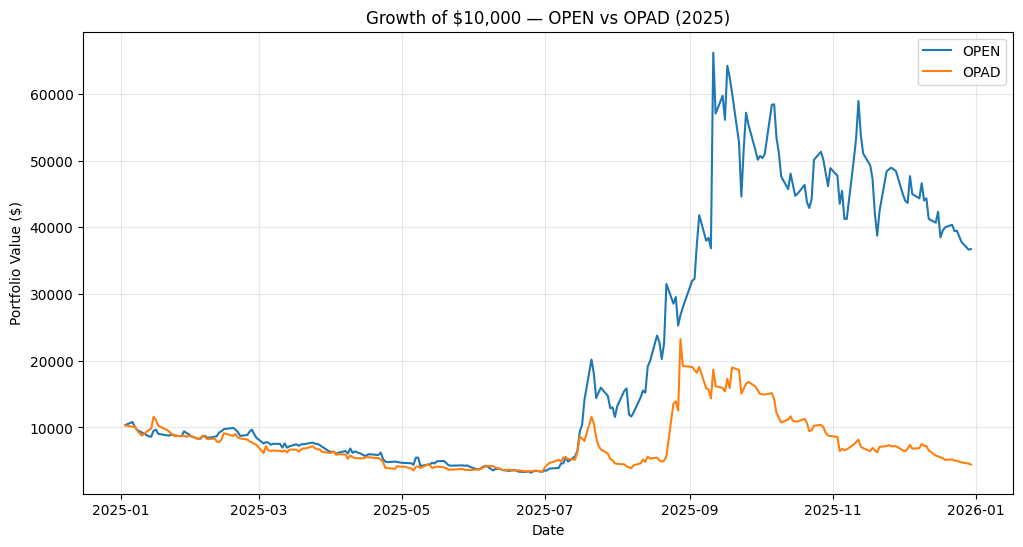
This chart shows what happened if you invested $10,000 in Opendoor (OPEN) or Offerpad (OPAD) at the start of 2025 and held through the year.
- The blue line (OPEN) shows a very sharp rise in the second half of the year. At its peak, the $10,000 investment grew to over $60,000. After that peak, the value dropped back, but still ended the year far above where it started.
- The orange line (OPAD) shows a very different path. It had a few short spikes, but overall the investment kept falling and ended the year well below $10,000.
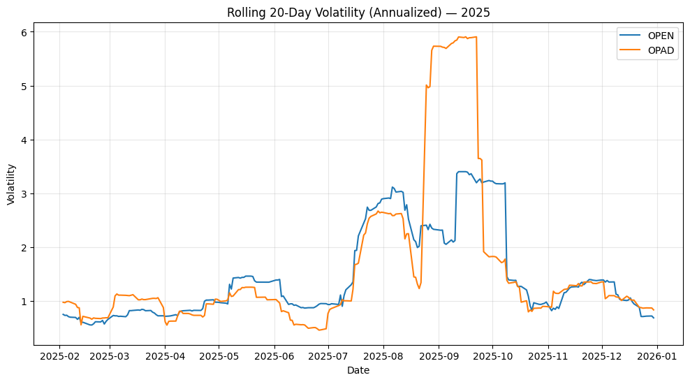
Rolling 20-Day Volatility in 2025: OPEN vs OPAD
This chart shows how wild the price moves were for Opendoor (OPEN) and Offerpad (OPAD) during 2025. Volatility here is measured over rolling 20-day periods, so it reflects short-term risk.
- The orange line (OPAD) spikes much higher than OPEN for large parts of the year. At its peak, OPAD’s volatility rises above 6, showing extremely sharp price swings.
- The blue line (OPEN) also becomes very volatile, especially in the middle of the year, but its spikes are lower and shorter than OPAD’s.
- Both stocks are calmer early in the year, then turn much more unstable around late summer and early fall, when most of the big price moves happen.
2025 Summary Takeaways
- Opendoor (OPEN) delivered the higher return in 2025.
- Offerpad (OPAD) had the lower return and finished the year down.
- OPAD was the more volatile stock, with larger and more frequent price swings.
- OPEN was less volatile, even though it still moved a lot.
- OPAD suffered deeper drawdowns, meaning bigger drops from its highs.
- OPEN had smaller drawdowns, making it easier to hold during pullbacks.
Bottom line:
In 2025, OPEN rewarded investors with much stronger gains, while OPAD experienced heavier swings and deeper losses. Both stocks were risky, but OPEN offered a better balance between return and risk during the
How One Tweet Changed Opendoor’s Stock
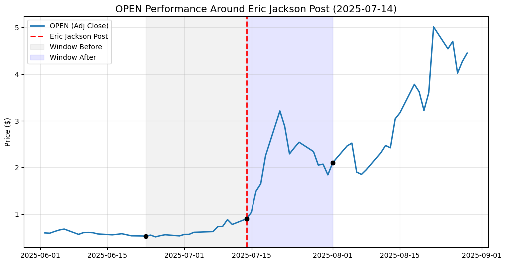
This chart shows what happened to Opendoor (OPEN) around the time Eric Jackson, a hedge fund manager at EMJ Capital, posted publicly about the stock on July 14, 2025.
The blue line shows Opendoor’s stock price. The red dashed line marks the day of Eric Jackson’s post. The shaded areas show the 14 trading days before and 14 trading days after that post.
Before the post, OPEN was trading quietly. The price stayed under $1 and moved slowly, showing very little investor attention. That period is shown on the left side of the chart.
Right after the post, things changed fast. In the shaded area to the right of the red line, the stock jumped sharply, moving from under $1 to over $3 in a short time. Volatility increased, daily moves became larger, and trading activity picked up.
As the days went on, the stock kept moving higher, eventually reaching prices above $5. While there were pullbacks along the way, the overall trend after the post was clearly upward.
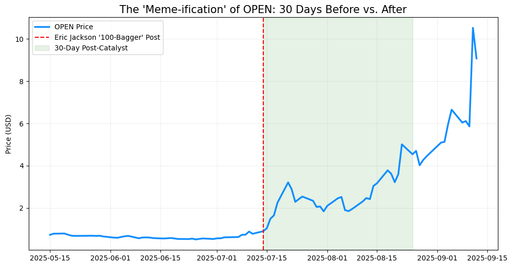
The “Meme-ification” of Opendoor: What Changed After the Post
This chart shows how Opendoor (OPEN) behaved in the 30 trading days before and after a key moment: Eric Jackson’s public post on July 14, 2025, where he shared a very bullish view on the stock.
The blue line is OPEN’s stock price.
The red dashed line marks the day of the post.
The green shaded area shows the 30 trading days that followed.
Before the Post: Quiet and Ignored
On the left side of the chart, before the red line, OPEN is mostly flat. The stock trades below $1, with small daily moves and very little momentum. This is what a stock looks like when it’s largely ignored—low attention, low excitement, and low trading activity.
There’s no strong trend, no big spikes, and no urgency from investors.
After the Post: A Sudden Shift
Right after the red line, everything changes.
Within days, the stock jumps sharply, quickly moving above $2 and then higher. Daily swings become much larger, pullbacks get bought quickly, and the overall trend turns upward. This is the start of what many investors call a “meme-style” move—a rapid shift driven by attention, narrative, and momentum rather than slow fundamentals.
DISCLAIMER: NOT FINANCIAL ADVICE
The content on this blog (including all text, data, code, and charts) is provided for educational and informational purposes only. I am not a licensed financial advisor, investment builder, or tax professional.
Investments involve risk: The stock market is volatile, and you can lose part or all of your investment. Past performance is not a guarantee of future results. Any tickers mentioned are used as examples of historical data analysis and are not recommendations to buy or sell.
Do your own research: Before making any financial decisions, you should conduct your own due diligence or consult with a qualified financial professional. Use of the Python code provided in these posts is at your own risk; I am not responsible for any financial losses or technical errors resulting from the use of this information.