
2025 brought some surprises in the stock market. Among the well-known tech companies, a few stood out with strong gains that caught many investors’ attention. Here, we look at the Top Magnificent 7 performers and show how each stock did. Check the chart below to see the details
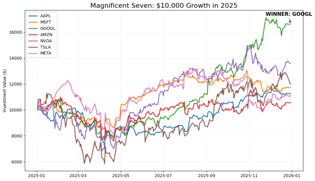
While most of the “smart money” was betting on Nvidia (NVDA) to keep its lightning-fast momentum, Alphabet (GOOGL) quietly stole the show.
The chart shows Alphabet’s line climbing much steeper than its peers, especially in the second half of the year. This wasn’t just a small win; it was a dominant breakout that proved Google’s AI “defensive moat” was much stronger than the skeptics thought.
The $10,000 Race: Who Finished First?
Imagine you invested $10,000 on New Year’s Day 2025 and split it between these well-known companies. This chart shows how much that money would be worth by the end of the year.
Alphabet (Google) pulled far ahead of the others, growing $10,000 into about $16,600. Nvidia followed behind with solid gains, but there was a clear gap between the top performers and the rest.
Even popular companies like Amazon only saw small increases compared to the leaders. This chart shows how much your results can change depending on where your money is placed at the start of the year.
2025 Scorecard: From Start to Finish
| Rank | Company | Money at Start | Money at End | Total Profit |
| 1 | Alphabet (GOOGL) | $10,000 | $16,600 | +$6,600 |
| 2 | Nvidia (NVDA) | $10,000 | $13,600 | +$3,600 |
| 3 | Tesla (TSLA) | $10,000 | $12,100 | +$2,100 |
| 4 | Microsoft (MSFT) | $10,000 | $11,600 | +$1,600 |
| 5 | Apple (AAPL) | $10,000 | $11,200 | +$1,200 |
| 6 | Meta (META) | $10,000 | $11,000 | +$1,000 |
| 7 | Amazon (AMZN) | $10,000 | $10,500 | +$500 |
Who Jiggled the Most? (Volatility)
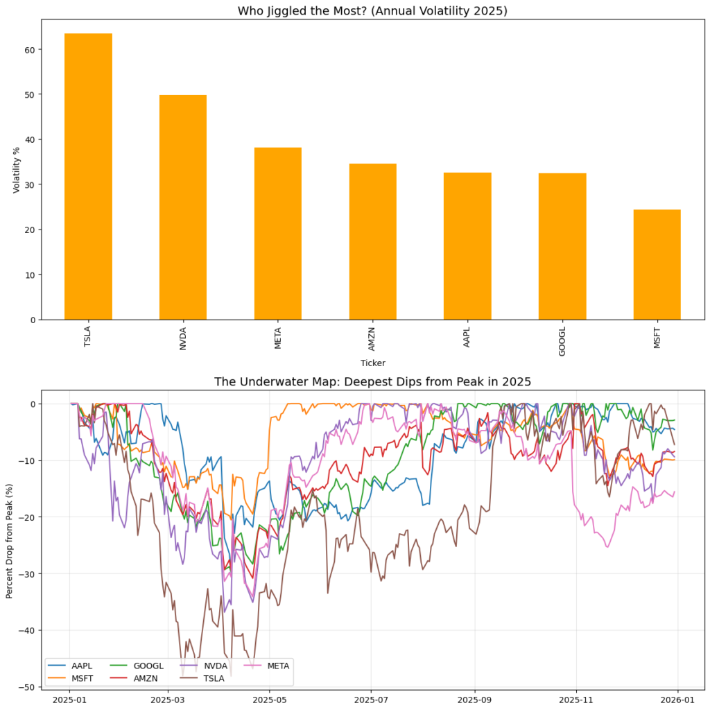
The top bar chart shows volatility, which means how much a stock’s price moved up and down during the year.
- Tesla moved the most. Its price changed a lot from day to day.
- Nvidia also had big swings, but less than Tesla.
- Meta and Amazon were in the middle.
- Apple, Google, and Microsoft moved less compared to the others.
Big takeaway:
Higher bars mean a rougher ride. Lower bars mean smoother movement.
Bottom Chart: The Underwater Map (Drops from the High)
The bottom line chart shows how far each stock fell from its highest price during the year.
- The lines go down when a stock drops from its peak.
- The deeper the line goes, the more painful the drop.
- Tesla and Nvidia had the deepest drops at different points in the year.
- Apple and Microsoft stayed closer to the top most of the time.
- Google and Meta had drops, but not as deep as the biggest movers.
Big takeaway:
Even stocks that finished the year higher had periods where they were down a lot.
Why This Matters
These charts show something returns alone don’t:
- A stock can end the year up and still be hard to hold
- Big gains often come with big drops along the way
- How much a stock “jiggles” matters just as much as where it finishes
In short:
This chart shows what it felt like to own these stocks during 2025, not just how they ended.
2025 Risk Report
| Ticker | Price Movement (Volatility %) | Biggest Drop (%) |
|---|---|---|
| TSLA | 63.42% | -48.19% |
| NVDA | 49.73% | -36.88% |
| META | 38.09% | -34.15% |
| AMZN | 34.55% | -30.88% |
| AAPL | 32.53% | -30.22% |
| GOOGL | 32.47% | -29.81% |
| MSFT | 24.33% | -20.56% |
What This Table Means
This table shows how rough the ride was for each stock in 2025. The first column shows how much prices moved up and down during the year. The second column shows the largest drop from the highest point, even if the stock later recovered.
Key Things to Notice
- Tesla moved the most and also had the largest drop, falling almost 50% at one point.
- Nvidia and Meta had big swings and deep drops, which made them harder to hold.
- Microsoft moved the least and had the smallest drop, making it easier to sit through the year.
- Apple, Google, and Amazon sat in the middle — noticeable drops, but not the deepest.
Conclusion
These two charts together show the full picture of investing in the Magnificent Seven during 2025. The $10,000 chart shows how each investment grew over time, while the risk table shows how rough the ride was to get there.
Tesla was the most volatile stock. It had the biggest price swings and the deepest drop, falling almost 50% at one point. Nvidia also moved a lot and had large pullbacks. These stocks offered strong upside, but they required investors to handle sharp moves and deep drops along the way.
Microsoft was the least volatile. Its price moved the least and had the smallest drop during the year, making it easier to hold compared to the others.
Google sits in the middle. Its price movement was lower than Tesla, Nvidia, and Meta, and its biggest drop was under 30%. At the same time, the $10,000 chart shows Google finishing near the top in final value. This means Google delivered strong results without extreme swings.
DISCLAIMER: NOT FINANCIAL ADVICE
The content on this blog (including all text, data, code, and charts) is provided for educational and informational purposes only. I am not a licensed financial advisor, investment builder, or tax professional.
Investments involve risk: The stock market is volatile, and you can lose part or all of your investment. Past performance is not a guarantee of future results. Any tickers mentioned are used as examples of historical data analysis and are not recommendations to buy or sell.
Do your own research: Before making any financial decisions, you should conduct your own due diligence or consult with a qualified financial professional. Use of the Python code provided in these posts is at your own risk; I am not responsible for any financial losses or technical errors resulting from the use of this information.