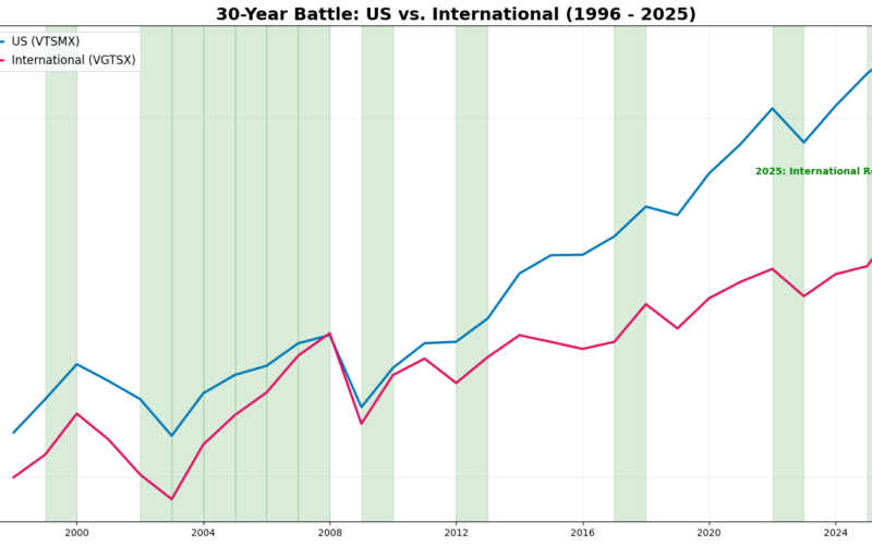
What if you invested the same dollar in U.S. stocks and international stocks nearly 30 years ago—and never touched it?
Starting in the mid-1990s, it tracks the growth of two diversified portfolios over time: one invested in U.S. equities and the other in international equities. Both lines rise and fall through booms, crashes, and recoveries, with major global recessions highlighted along the way. The vertical axis uses a logarithmic scale, meaning the focus is on long-term growth rates, not short-term noise.
For most of the past three decades, U.S. stocks clearly dominated, compounding faster and pulling far ahead. But the ending is what makes this chart interesting: after years of underperformance, international stocks begin to reassert themselves, reminding investors of a lesson markets teach again and again—leadership changes, often when few expect it.
This isn’t just a performance chart. It’s a visual history of patience, cycles, and why diversification debates never truly end.
Leadership rotates.
To see that rotation clearly, you have to zoom in from decades to individual years. That’s where the annual returns table comes in.
Below is the year-by-year scorecard showing which market won each calendar year.
Annual Returns: U.S. vs. International (%)
| Year | U.S. | International | Winner |
|---|---|---|---|
| 2025 | 17.59 | 32.38 | Intl |
| 2024 | 23.11 | 5.30 | US |
| 2023 | 26.38 | 15.17 | US |
| 2022 | -19.60 | -16.07 | Intl |
| 2021 | 25.59 | 8.58 | US |
| 2020 | 20.87 | 11.16 | US |
| 2019 | 30.63 | 21.44 | US |
| 2018 | -5.27 | -14.46 | US |
| 2017 | 21.05 | 27.39 | Intl |
| 2016 | 12.54 | 4.63 | US |
| 2015 | 0.28 | -4.38 | US |
| 2014 | 12.43 | -4.24 | US |
| 2013 | 33.34 | 15.04 | US |
| 2012 | 16.25 | 18.15 | Intl |
| 2011 | 0.97 | -14.49 | US |
| 2010 | 17.09 | 11.12 | US |
| 2009 | 28.68 | 36.72 | Intl |
| 2008 | -37.04 | -44.07 | US |
| 2007 | 5.49 | 15.51 | Intl |
| 2006 | 15.51 | 26.64 | Intl |
| 2005 | 5.98 | 15.57 | Intl |
| 2004 | 12.52 | 20.83 | Intl |
| 2003 | 31.35 | 42.03 | Intl |
| 2002 | -20.97 | -14.66 | Intl |
| 2001 | -10.98 | -20.14 | US |
| 2000 | -10.19 | -15.28 | US |
| 1999 | 25.15 | 30.06 | Intl |
| 1998 | 23.85 | 15.72 | US |
| 1997 | 32.62 | -0.54 | US |
What This Table Adds to the Chart
The long-term chart makes U.S. dominance look smooth and inevitable.
This table shows the truth: it wasn’t.
1. International Outperformance Came in Clusters
- Early 2000s (2003–2007): International won five years in a row
- Post-crisis rebounds (2009, 2012, 2017)
- Recent resurgence (2025)
These clusters are exactly what create the sharp catch-ups you see in the chart.
2. U.S. Dominance Was Real—but Concentrated
- 2013–2021: U.S. wins most years
- Fueled by:
- Tech concentration
- Higher profit margins
- Stronger dollar
This explains why the blue line pulls away so dramatically after 2010.
3. The Ending Matters
The chart ends with international stocks finally accelerating again.
The table confirms it:
- 2025: International +32.38% vs. U.S. +17.59%
How Many Years? Who Won?
- Total years analyzed: 29 years (1997–2025)
- International outperformed the U.S.: 12 years
- U.S. outperformed International: 17 years
So even though the U.S. won more individual years, international stocks still had long, powerful stretches of outperformance.
Why This Matters (Context)
Outperformance doesn’t alternate neatly year by year.
- International wins tended to cluster (late 1990s, early–mid 2000s, select post-crisis years, and 2025)
- U.S. dominance was heavily concentrated in the 2010s
- A few strong runs—not constant winning—drive long-term results
This explains why international stocks can lag for years, then suddenly close the gap fast, as shown at the end of the chart.
Conclusion
Over the last 29 years, international stocks beat U.S. stocks in 12 separate years—not the majority, but far too often to ignore.
The lesson isn’t that international always wins, or that the U.S. always dominates.
The lesson is that market leadership rotates, and it often does so after long periods of disappointment.
If you wait for international stocks to “prove it,” you usually miss the years that matter most.
If you stay diversified, you don’t need to predict when leadership changes—you’re already positioned when it does.
DISCLAIMER: NOT FINANCIAL ADVICE
The content on this blog (including all text, data, code, and charts) is provided for educational and informational purposes only. I am not a licensed financial advisor, investment builder, or tax professional.
Investments involve risk: The stock market is volatile, and you can lose part or all of your investment. Past performance is not a guarantee of future results. Any tickers mentioned are used as examples of historical data analysis and are not recommendations to buy or sell.
Do your own research: Before making any financial decisions, you should conduct your own due diligence or consult with a qualified financial professional. Use of the Python code provided in these posts is at your own risk; I am not responsible for any financial losses or technical errors resulting from the use of this information.